Project WebApp
How to style react
May 08, 2018
The classic approach to styling in the browser is creating a
css file and provide it with a <link /> tag. The tutorial
from last session also worked with an external css file, but
linked it by adding a JS import statement. The benefits of
this way are an easy separation of concerns and the already
known workflow of styling html elements.
But the separation of concerns also leads to another path. In react an application is separated into components, but the workflow of defining global style-classes is quiet contrary. So why not rethink it?
Christiano Rastelli made this wonderful graphic, which shows a new way of drawing boundaries in a component oriented application architecture.
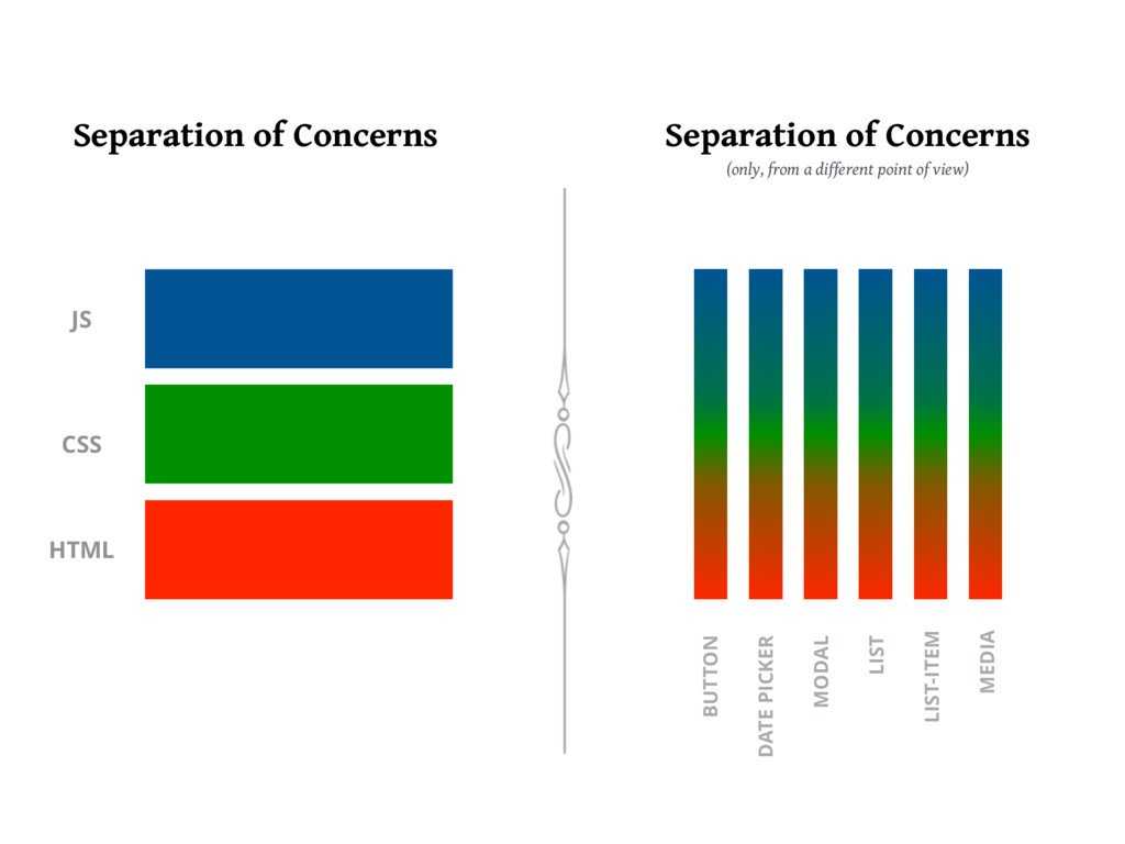
By separating the architecture in this way, a component becomes responsible for its behavior (JS), layout (html) and design (css). All these concerns should only be influenced by the component itself.
One viable solution is to use normal css rules with unique style rules for every component. For very small projects this approach is well suited but as soon as a project becomes a bit larger and the component count rises it gets harder and harder to name the css rules in its global namespace. To eliminate this downside of css the simplest solution is to just use inline styling.
const Title = props => (
  <h1
    style={{
      fontSize: "1.5em",
      textAlign: "center",
      color: "forestgreen",
    }}
    {...props}
  />
);
It is simple, but some important features are missing (for example media-queries and keyframe animations) and it’s not as performant as css-class-rules.
The solution: Take the best from both worlds!
Write the style rules in JavaScript, but generate class-rules. The most commonly used library to support this workflow is styled-components 💅, which enables you to define components, only containing information about the element type and styling. Those are very well suited as the basic building blocks of any web app. To work with, the styled component lib provides a tagged template literals factory for each html base element.
import styled from "styled-components";

const Title = styled.h1`
  font-size: 1.5em;
  text-align: center;
  color: forestgreen;
`;
It’s even possible to generate style depending on the component props by inserting functions into the template string.
import styled from "styled-components";

const Title = styled.h1`
  font-size: 1.5em;
  text-align: center;
  color: forestgreen;

  ${props =>
    props.primary &&
    css`
      background: forestgreen;
      color: white;
    `};
`;
This string based generation of styles has the benefit of common syntax, if you know css. But in comparison to writing simple objects it can get cumbersome if you are working with many variables.
Like always in the JavaScript world, if there is a problem, there will be a lib. For this case glamorous 💄 delivers. It has an api quiet similar to styled-components but instead of working with template-strings you define the styles like the react inline styles as objects. For more complex scenarios the component generator function can take multiple arguments, either a style object or a function returning a style object.
import glamorous from "glamorous";

const Title = glamorous.h1(
  {
    fontSize: "1.5em",
    textAlign: "center",
    color: "forestgreen",
  },
  props =>
    props.primary && {
      background: "forestgreen",
      color: "white",
    },
);
Last but not least emotion should be mentioned. This lib enables you to work with both template-strings and objects.
import styled from "react-emotion";

const Title = styled("h1")`
  font-size: 1.5em;
  text-align: center;
  color: ${props =>
      props.primary ? "white" : "forestgreen"} forestgreen;
  background: ${props =>
    props.primary ? "forestgreen" : "unset"};
`;
import styled from "react-emotion";

const Title = styled("h1")(
  {
    fontSize: "1.5em",
    textAlign: "center",
    color: "forestgreen",
  },
  props =>
    props.primary && {
      background: "forestgreen",
      color: "white",
    },
);
Tasks
- clone the
chat-app-start
repository and start the dev-server (
npm start) - choose one of the styling approaches styled-components, glamorous, emotion and install needed dependencies
- start styling the
UserandMessagecomponents, you can find some inspiration on dribble or google images
Written by Kalle Ott for opencampus